Design Mobile Navigation That Works in 2026

 Jun 22,2026
 By SEO ANALYSER
Mobile UX & navigation
Mobile navigation decides whether visitors stay long enough to convert. Clear menus, touch-friendly targets, and familiar patterns cut friction, lift engagement, and help search engines understand your site structure.
Short answer
Simple, touch-friendly menus keep users (and crawlers) moving
Mobile navigation works when it is short, clearly labelled, easy to tap, and consistent on every page. Choose the pattern that matches your content (visible tabs, hamburger, sticky bar, or bottom nav), keep sticky and bottom bars to a few high-priority actions, size targets at least 44×44 pixels, and test on real devices. Clean menus reduce bounce and help search engines crawl and map your structure.
Core principles
What are the core principles of mobile navigation design?
Mobile navigation directly affects whether visitors stay on your site or leave within seconds. Poor menus are one of the main reasons users abandon a site before converting, and the problem is more common than most businesses realise.
An online retailer in Sydney found that nearly 70% of its traffic came from mobile devices, yet sales were underperforming. After simplifying the mobile menu and reducing the number of options, conversions jumped by 25% in just two months. Many digital marketers report the same pattern; the fix is rarely technical; it is structural. That structural work is a core part of mobile UX optimisation.
Good mobile navigation feels intuitive, simple, and fast. Every effective design decision comes back to these four principles:
- Simplicity: Keep menus short and focus only on essential items. Every extra option adds friction and slows the user down.
- Clarity: Use plain, descriptive labels so users know exactly where each link will take them before they tap.
- Accessibility: Menus should be easy to open, close, and interact with across all device types and screen sizes, which is also a foundation of website accessibility.
- Consistency: Use familiar patterns across every page so users never have to re-learn how to browse your site.
A major Australian bank applied these principles when restructuring its mobile app. Core features, Check Balance and Transfer Funds, were moved to the front, and customer satisfaction scores rose noticeably as a result (as of 2024).
Hamburger menu
Is the hamburger menu always the best choice?
The hamburger menu saves space, which is why it is so widely used. The downside is that it hides options and reduces discoverability, which can hurt engagement on content-heavy sites.
A Melbourne news site replaced its hamburger menu with a visible tab-based navigation showing News, Sport, and Business. Page views per session rose by 40% because users could immediately see what was available.
If you keep a hamburger menu, add the word Menu next to the icon.
- Use “Menu” beside the icon.
- Test icon-only versus labelled versions.
- Use visible navigation when discovery matters.
Sticky navigation
How effective is sticky navigation?
Sticky navigation keeps key actions visible as users scroll, especially useful for e-commerce sites where the cart or search needs to stay accessible at all times.
A Brisbane clothing retailer added a sticky navigation bar with a floating Cart button. Within one quarter, abandoned cart rates fell by 18% because shoppers could return to checkout more easily while browsing products.
Keep sticky navigation focused on the actions users need most often instead of turning it into a second full menu.
- Limit the sticky bar to 2 or 3 high-priority actions.
- Use it for Cart, Search, or Contact.
- Avoid crowding the bar with low-value links.
Touch targets
How do touch-friendly elements improve usability?
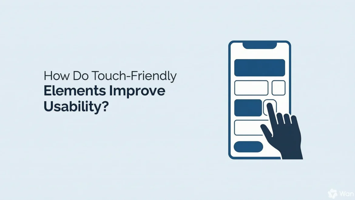
Touch-friendly design means every interactive element is easy to tap accurately on the first attempt. On mobile, a single missed tap is often enough to make a user give up and leave. In practice, improving mobile UX often starts with fixing those tap targets before redesigning the whole menu.
An Adelaide service business redesigned its contact page with larger Call Now and Book Appointment buttons. Call enquiries increased by 30% within the first month, not because the service changed, but because acting on it became easier [Representative example, industry reporting].
Best practices for touch-friendly mobile design:
- Design tap targets at a minimum of 44×44 pixels, the standard recommended by both Google and Apple.
- Add at least 8px of space between interactive elements to prevent accidental taps.
- Use 16px or larger for body text so it stays readable on small screens.
- Avoid placing important links too close to screen edges.
Designing on a desktop and assuming interactions will feel the same on a phone. Always test on a real device, not just a browser simulation.
Testing tools
What tools help test mobile navigation?
Testing shows where users are actually struggling, and it is often not where you expect. These four tools cover most of what you need:
- Google Mobile-Friendly Test: Checks whether your site meets mobile usability standards, good for a quick technical audit.
- Hotjar: Provides heatmaps and session recordings so you can watch real user behaviour on your site.
- Crazy Egg: Tracks clicks and scroll depth to help identify exactly where users drop off.
- PageSpeed Insights: Flags navigation elements that are slowing down page load times.
A Sydney tech startup used Hotjar to review how users moved through their site. They found the pricing page was buried and hard to reach. After moving it into the main navigation, sign-ups rose by 20%.
Start by running a session recording on your most important conversion page. Watch five to ten real sessions, and you will spot the main friction points within an hour.
Common mistakes
What are the common mobile navigation mistakes?
Most mobile navigation problems come back to the same handful of issues. They are easy to overlook during design but immediately obvious to users.
A Melbourne retailer had overlapping menu items and too many pop-ups blocking content. After simplifying the design and cutting back interruptions, the bounce rate dropped by 35%.
Mistakes to avoid:
- Overloaded menus with too many links; aim for five to seven items maximum.
- Small fonts and tap targets that are difficult to hit accurately.
- Intrusive pop-ups that block content on page entry.
- Not testing across different devices and operating systems; a menu that works on iPhone may break on Android.
- Applying desktop navigation patterns directly to mobile without rethinking the structure.
SEO support
How does mobile navigation support SEO?
Mobile navigation directly affects how well your site ranks. Clear menus help search engines crawl and understand your site structure just as much as they help users move through it.
A Brisbane travel agency grouped its services under clearer categories: Domestic Tours, International Tours, and Custom Packages. Engagement improved, and rankings for relevant terms rose noticeably (as of 2024). A Melbourne e-commerce site that simplified product categories and added sticky navigation saw customers spend 40% longer on-site, and product pages gained better visibility as Google could more easily map the structure [Representative examples, industry reporting].
How mobile navigation affects SEO directly:
- Crawlability: Menus guide search engine crawlers to discover and index your key pages.
- User signals: Smooth navigation reduces bounce rate and lifts dwell time, both positive ranking signals.
- Internal linking: Menus and breadcrumbs distribute link equity across the site, strengthening the visibility of core service or product pages.
FAQs
Mobile navigation FAQs
What is the best type of mobile navigation menu?
It depends on your site. E-commerce stores typically benefit from sticky or bottom navigation, which keeps the cart and search always accessible. Content-heavy sites often work better with a hamburger menu that organises multiple categories without cluttering the screen.
How do I know if my mobile navigation is effective?
Check bounce rate, session duration, and pages per visit in your analytics. Use Hotjar or Microsoft Clarity to watch real user sessions. If users are dropping off quickly or not reaching key pages, navigation is usually a contributing factor.
Does mobile navigation affect SEO?
Yes, directly. Clear menus help search engines crawl and index your site more effectively, and better navigation improves engagement signals like dwell time and pages per session, both positive ranking factors.
Should I use a sticky navigation bar?
Yes, particularly if your pages involve significant scrolling. Keep the sticky bar to two or three essential actions so it helps without cluttering the screen.
How can small businesses improve mobile menus quickly?
Cut your menu to three to five core links, increase button size to at least 44×44 pixels, and run a Google Mobile-Friendly Test to catch obvious issues. These changes alone can deliver noticeable improvements with minimal development work.
What are the most common mistakes in mobile navigation?
Overloaded menus, small tap targets, intrusive pop-ups, and failure to test across different devices. Designing for desktop first and adapting for mobile second is also a frequent cause of poor results.
How often should mobile navigation be reviewed?
At least once or twice a year, or sooner if bounce rates rise or conversions drop. User behaviour and device types shift over time, and your navigation should keep pace.
Summary
Mobile navigation is one of the most overlooked parts of website design, yet it strongly shapes whether users stay or leave. As mobile browsing now drives most web traffic in Australia, a confusing menu is not just a design problem; it is a conversion problem.
Hamburger menus, sticky navigation, bottom navigation, and touch-friendly layouts each solve different constraints, and the Australian business examples in this guide show measurable gains when menus get simpler and easier to tap. Cluttered menus, tiny buttons, intrusive pop-ups, and weak cross-device testing still push users away before they act.
Sources
Sources and further reading
- SEO AnalyserMobile UX optimisation for SEO
- SEO AnalyserWhy breadcrumbs remain essential for SEO and user navigation
- SEO AnalyserImproving mobile user experience: UX best practices for SEO
- SEO AnalyserDoes website accessibility improve SEO?